Shannon Soper
What’s unique about developer tool design?
What’s unique about developer tool design? How is it different from consumer-facing products?
Popular answer to this question: developer tool design is entirely different from consumer product design. My answer: they actually share the same fundamental design principles, yet the way a designer executes on those principles in the UI often looks very different.
I’ll give an example of a fundamental design principle and how the same principle can lead to wildly different user experiences.
Present the data necessary to answer user’s questions
Bret Victor, a designer, writes that one way to decide what makes a “good” design is to ask yourself “does this design present all the data necessary to answer a user’s questions?”
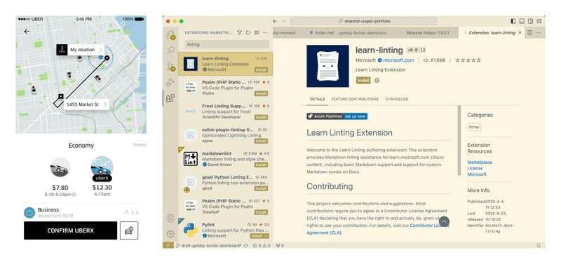
Let’s compare a user’s questions when ordering an Uber vs. comparing plugins on VS Code. The screenshot below shows Uber's interface on the left and VS Code's on the right.
If I’m ordering an Uber, I ask things like “which ride is the best deal? Which car is big enough for my child’s stroller? Will it arrive fast enough?” I am satisfied when the app answers those questions for me.
If I’m creating a website from scratch and using VS code, I might want to compare plugins or extensions and have questions like: “does this plugin meet my needs? Is it reliable? How easy is it to get started?” The way the UI helps me answer these questions looks a lot more dense than Uber’s app does because it presents me with 50x more data.
Information density
The density of data in dev tool design is necessary because users have open-ended questions that they answer through creative exploration. For example, “is there a faster way to create routes for my website’s pages?” might lead a developer to look at other people's projects and then test out the same strategies they've seen to see if it works or produces errors. A good designer friend of mine, Anton Lovchikov, says that because developers are creators, a “hyper-saturated interface” is ideal. By surfacing all frequent actions (and there are a lot) in the UI and hiding less frequent actions, a hyper-saturated interface speeds up developer workflows.
In contrast, interfaces intended mostly for the consumption of data surface fewer actions, so the interface is usually focused on a select few points of user interaction (say, a checkout flow, which might have a few text input fields and one button).
Can't we hide complexity in developer tools?
Yes and no. Developers are professionals who make creative choices that require a lot of human work. In other words, the tool might be able to provide templates or boilerplate code, but it can’t do custom work with expertise. For example, while Uber does almost all the work for the user, VS code doesn’t get the user nearly as close to completing their task because that task requires more creativity.
However, there are smart ways to hide complexity. Here are ways of hiding complexity that don't hinder creativity:
- provide boilerplate and frameworks that bundle standard actions
- hide less frequent actions in dropdowns, settings, etc.
- use smart defaults and ask the user if the default is correct or if they want to change it
- anticipate user questions. For example, if you know users will want to compare plugin options, productize that comparison! Make it easy to compare plugins side-by-side
“Too cluttered” or cluttered enough?
Here’s a story about how I made a design decision when working at Gatsby (a developer tool).
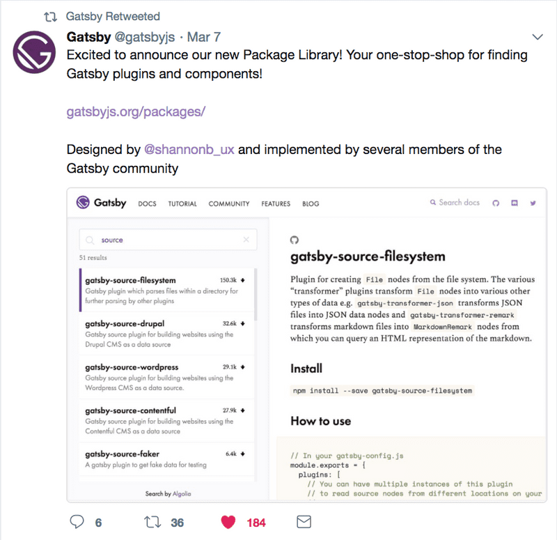
When I posted my first sketches for Gatsby’s plugin library in a general design slack community feedback channel (not focused on dev tools), people said it was too cluttered and that there was not enough white space. Here's the tweet announcing the plugin library, which shows a screenshot of what it looked like at the time (my original designs are in Sketch, which I no longer have).
In contrast to the "too cluttered" feedback, the Gatsby open source community loved the design. I considered both types of feedback and then made a judgment call based on fundamental design principles.
I stuck with the “cluttered” design because it did a good job of answering the user’s main questions, like “does this plugin meet my needs? Is it reliable? How easy is it to get started?”.
Can no code / low code tools take over?
I don't think no code tools are likely to replace developer tools soon. Because even with the densest possible interface, there’s not enough room in the UI for all the interactions a developer needs. For example, In a Javascript file in VS code, the system will suggest things to me, but only after I start typing. I have to have something in mind before I start typing something. That’s because the UI simply doesn’t have room for everything that a person can fit in their head. No-code tools try to change that but it’s really hard to replace the human brain :).
See "Can't we hide complexity in developer tools?" for examples of how to have lower code tools.
What difference can design principles make in developer tools?
The biggest difference a designer can make in a dev tool is to play with the timing and placement of data.
- When does the user need this data?
- What data is most important and how can I draw attention to it?
Uber’s designers ask the same questions but they hide a lot more data because users don’t need it. E.g. they probably could present each vehicle’s tire brand, but who wants that?
API schemas, on the other hand...yes, developers want that.

